

Behavioral Concept Component Library
Making behavioral science practical, usable, and embedded in every design decision.
Role: Experience Design Intern
Project Type: Team Work
Tools/Skills: User Research, User Interview, Prototyping
Introduction
During my internship with the Behavioral Science team at U.S. Bank, I was tasked with building a Figma component library that translated behavioral science principles into usable, compliant design assets. The challenge was to make behavioral concepts accessible and actionable for designers, so they could integrate them directly into their design process rather than treating them as abstract theories.
Prototype Overview
.png)
Problem
Although behavioral science was a growing priority, most principles existed in separate documentation.
Designers faced three key challenges:
-
Difficulty recalling principles at the moment of design.
-
Lack of a centralized toolkit to connect UX with behavioral insights.
-
No standardized way or process to include behavioral insights in design process.

“How might we help designers easily recall and apply behavioral science principles by creating a centralized, standardized toolkit that bridges the gap between behavioral knowledge and everyday design execution?”
Research & Discovery
Four Key Insights from Affinity Mapping Our Findings
1. Recall
Designers struggled to recall behavioral principles at the moment of design, often surfacing them too late.
2. Access
Concepts were scattered across ZeroHeight and docs; navigation felt cluttered and slowed adoption.
3. Integration
Designers wanted lightweight Figma components that link back to deeper resources, not separate documentation.
4. Confidence
Many lacked confidence in applying principles correctly and wanted contextual guidance/tooltips.
Ideation & Brainstorming
From our design ideations, we came up with strong design directions to guide us through this process
1. Clarity
2. Discoverability
3. Guidance
4.Flexibility
5. Efficiency
.png)
Design Process
Early Exploration: Dark Blue Components
In my first iteration, I designed the dark blue component set, which emerged from a team ideation session and reflected initial ideas for embedding behavioral concepts.
.png)
However, during user testing with designers, feedback revealed challenges:
-
The dark color drew too much attention and competed with existing design elements.
-
It reduced legibility and visibility when placed against certain backgrounds.
-
Designers worried it might not scale well for accessibility and executive-facing presentations.
Iteration: Light Blue Components
Based on this feedback, I transitioned the components into a lighter blue variant with drop shadow.
This iteration improved:
-
Clarity → The lighter shade made text easier to read and reduced visual competition.
-
Accessibility → Higher contrast ratios supported compliance with design guidelines.
-
Adoption potential → Designers found it less intrusive and easier to integrate into workflows
.png)
Before
The dark blue annotation components blend in too well with the template.
.png)
After
The lighter blue component with white border and drop shadow pops out better on the template, supporting clarity of the concept being tagged.
Final Component Library
1. Categorization: Organized by Common Design Problems
Designers often struggled to recall which behavioral principle to use. I addressed this by categorizing components by common design problems they frequently encounter.
.png)
2. Anatomy of Each Component Variant
Each variant was tailored for different levels of detail and usage scenarios:
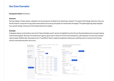
Annotation Variant
One-line reference with link to main page; ideal for quick tags in critiques.
Secondary Variant
Short summary for fast recall; often used in presentations.
Primary Variant
Full definition, context, and rationale; includes links for deeper exploration.
.png)
3. Instruction Card
To guide designers through using the Behavioral Concept Library (BCL) without needing external documentation. The card acts as a built-in onboarding tool inside Figma.
Next Steps
Before closing this project, I delivered a foundation that is both usable today and scalable for the future:
-
28 U.S. Bank–compliant components designed and ready for designers to use in their workflows.
-
Accompanying design guidelines to ensure consistency and clarity across teams.
-
Participation in the Figma AI Plugin initiative, where the Behavioral Concept Library will play a key role in surfacing concepts, tracking adoption, and making behavioral science more actionable.
.png)
Reflections
Early on, I realized that simply creating components wasn’t enough, the true value was in making behavioral science accessible and usable for designers in their day-to-day workflow.
This project taught me:
-
The importance of turning abstract research into tangible design tools.
-
How to facilitate ideation sessions and translate feedback into actionable iterations.
-
That small usability details (like color choice or tooltips) can make the difference between adoption and abandonment.
Most importantly, I saw how embedding behavioral science into design systems can bridge the gap between theory and practice, giving designers confidence to back decisions with evidence and communicate more effectively with stakeholders.